Case Study
Heurizztik
A rejection for "not enough research experience" became the question this tool answers: what if the heuristic pass happened before a single participant was recruited, so every hypothesis a researcher tests is already grounded, not guessed?
01 / Context
The problem was not a lack of design instinct. It was a lack of infrastructure.
I applied for a UX researcher role and was rejected for not having enough work experience. What the rejection made visible: I had been working as a designer at a startup in beta, with no dedicated researcher, no recruiting budget, and sprint cycles that moved faster than any study could close.
Every untested assumption that shipped was a team problem, not just a personal one. Engineers were building against guesses. PMs were escalating UX issues that a 30-minute heuristic review would have caught weeks earlier. The research gap had a cost, and it was not abstract.
Heurizztik is the response to that situation. Not a replacement for user research. A way to make the recruiting budget go further by doing the heuristic work before a single participant is recruited.
02 / Approach
Two phases: heuristic pre-screen, then human validation.
Phase 1 is a check against published research frameworks before any real user is involved. Phase 2 is where a researcher closes the loop with actual people. The handoff point between them is the test script the tool generates from flagged findings.
The hypotheses you bring into a session are already grounded. You're not testing random assumptions; you're testing what Nielsen and WCAG flagged as likely problems before you recruited anyone.
Phase 1: pre-screen
Phase 2: human validation
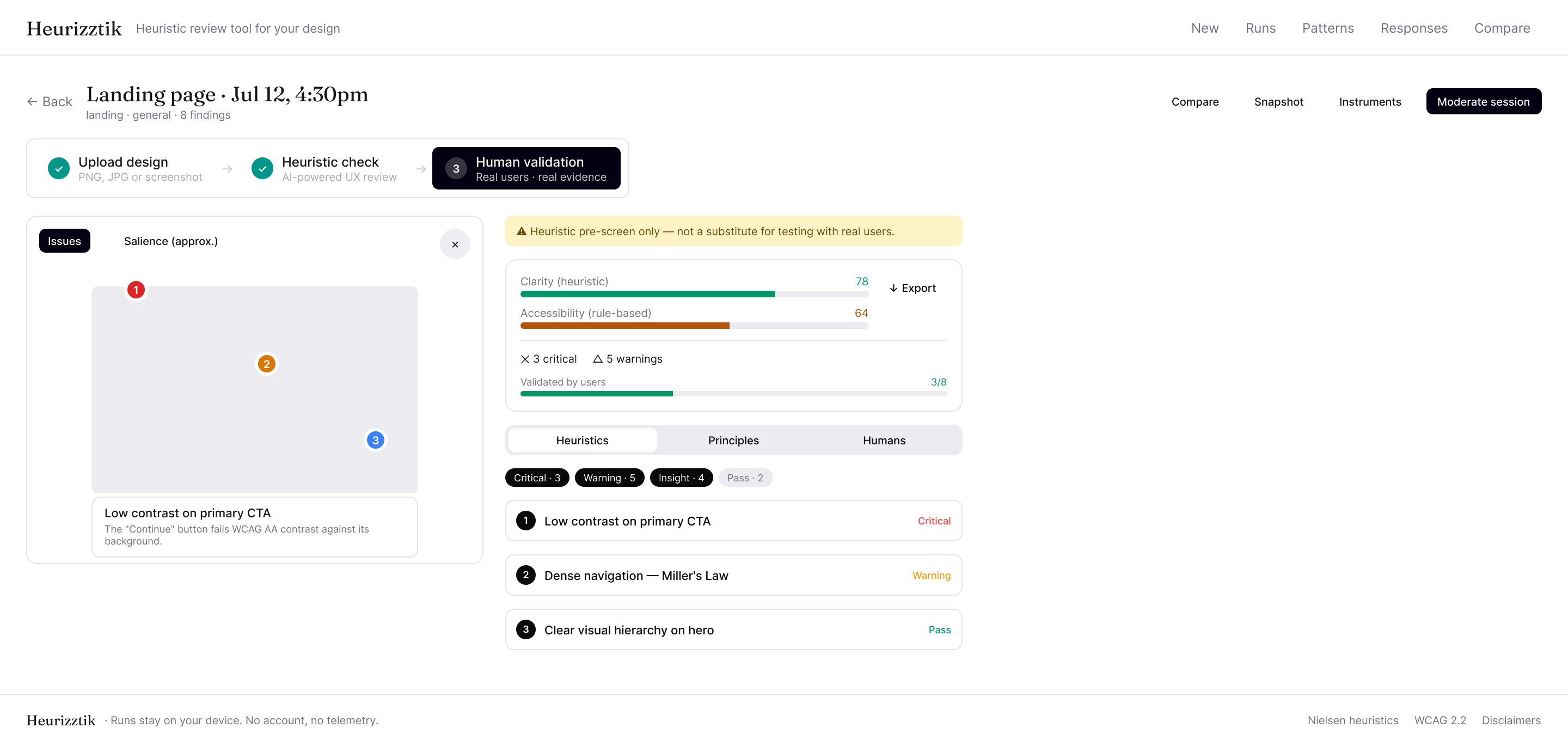
Phase 1 output: annotated design with finding pins, heuristic scores, severity breakdown, and cited violations ready to compile into a test script.
03 / Friction
What didn't go to plan.
With no researcher to check against, every call about scope, accuracy, and output format was mine to make and mine to defend. Three of them are worth explaining because the fix wasn't cosmetic, it changed what the tool was allowed to claim.
Confidence without calibration
AI-generated findings felt authoritative even when the inference was speculative. A flat list with no confidence signal trained users to treat everything as equally certain.
Evidence that vanished between sessions
Early builds stored validation evidence against finding IDs only. Re-running an analysis created a new session, orphaning old evidence. The patterns view showed zero validation on findings already confirmed.
Patterns view with no filter
Findings from multiple runs visible at once turned the patterns view into noise. Users could not tell a persistent problem from a one-off flag from a single run.
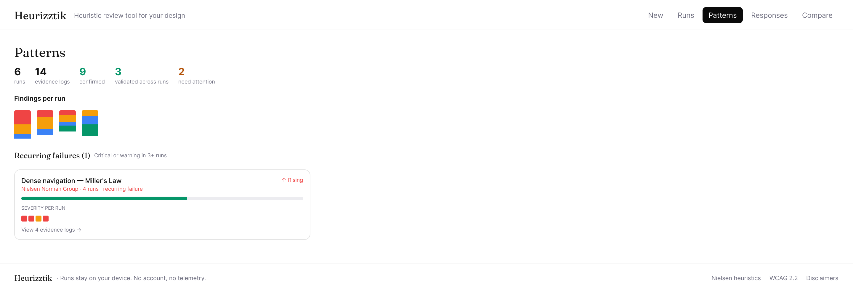
Patterns page: recurring failures surface with trend indicators, validation counts, and per-run severity history across all runs.
04 / Decisions
Where I had to choose.
Decision 01
Everything stays in the browser, no account required
Auth and database setup were out of scope for the hackathon timeline. Keeping everything in the browser is synchronous, zero-setup, and fast enough for how the tool actually gets used. The cap enforces a useful discipline: if you are reviewing the same design thirty-plus times, you probably need something other than history. The tradeoff is that runs do not follow you across devices, which felt acceptable for a tool designed to be opened, used, and closed quickly.
Decision 02
Test script compiled from findings, not generated fresh from the image
Each finding already includes draft validation questions from the heuristic pass. Compiling those into a script is deterministic and traceable: you know exactly which finding each question is testing. Generating a second round from the raw image would produce questions with no tie back to the flagged findings, making it harder to close the loop when evidence comes back from sessions.
Decision 03
Three confidence tiers instead of a score
A number implies precision the model does not have. Three tiers communicate something more useful: whether the finding comes from a measurable rule, a research-backed pattern, or an inference. The tier also determines how a finding travels across disciplines. A Deterministic finding can go directly to engineering. A Speculative finding needs human validation before it influences a roadmap decision.
05 / Validation
Six defects seeded into a test design. How many surfaced?
To measure recall, I ran the tool against a design with known violations: measurable failures (contrast ratio, tap target size), research-backed pattern violations (navigation overload, target placement, convention mismatch), and softer signals (emotional end moment, aesthetic masking).
| Issue | Seeded condition | Result |
|---|---|---|
| Hick’s Law | 9 nav items (threshold: 7 or fewer) | caught |
| Fitts’s Law | Primary CTA 28x28px (threshold: 44x44px) | caught |
| WCAG AA contrast | Body text at 3.8:1 (threshold: 4.5:1) | caught |
| Jakob’s Law | Cart icon top-left (convention: top-right) | caught |
| Peak-End Rule | Confirmation screen, no positive close moment | partial |
| Aesthetic-Usability | High polish masking task-failure risk | partial |
Catch rate
4 of 6 seeded violations surfaced in a single pass. Deterministic checks: 4 of 4 (100%). Speculative signals: partially flagged, which honestly reflects the model's limits.
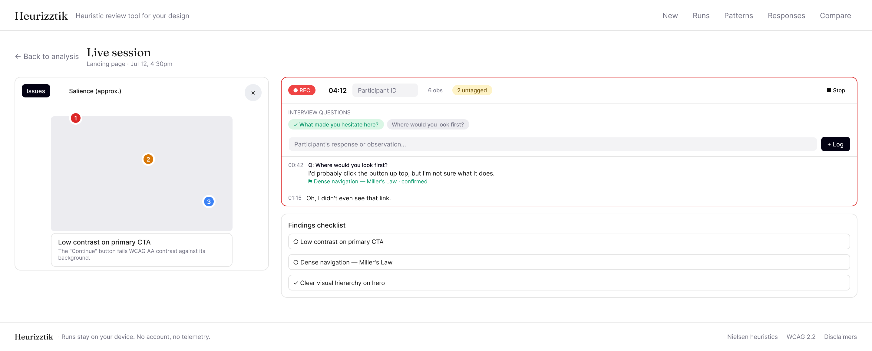
Live session view: participant observations are tagged to flagged findings in real time, connecting AI pre-screen analysis to human evidence.
06 / Roadmap
What I'd change before handing this to someone else.
The tool works for me because I know how the confidence model behaves. Making it work for someone who didn't build it is a different problem, and it breaks into three things.
- 1 Get external calibration. Recruit UX experts to rate the same design independently, compare their severity judgments against the tool's output, tighten the model where they diverge. Right now I'm the only reference point for whether the output is good.
- 2 Add a sharing mode. Findings currently live in your browser and nowhere else. A read-only snapshot link would let them travel with the design in Slack or email, which is how research actually moves through a team.
- 3 Evaluate prototypes, not just static frames. The heuristic pass works on images but a lot of what matters in a design only shows up in interaction. Figma prototypes and hosted URLs are the next obvious surface.
Reflection
The thing I kept running into was the gap between what the analysis surfaces and what a researcher would actually act on. The confidence tier model was an attempt to make that gap visible rather than paper over it. Whether it works well enough for someone else to use is still an open question.
Building the patterns view taught me something about the difference between data that accumulates and data that means something. Aggregating findings across runs is the easy part. Knowing when that aggregation is producing signal versus noise is much harder. The recurring failures threshold is a heuristic about a heuristic tool, which is a strange position to be in.
The rejection that started this is still the right framing. Not because the tool proves I can do research, but because building it made the infrastructure problem visible in a way that a project brief never would have. Whether I understood the problem well enough to build something coherent: I think yes. The roadmap is doing the honest work of saying where it isn't finished.